Getting started: Service Portal Designer
On this page
Introduction
The Service Desk Service Portal is the place your end users should be able to quickly and easily find all they are looking for. With this in mind, SolarWinds wants to make sure you can arrange the page in a manner that suits you. The ability to design your portal home page is available for all Advanced and Premier packages. You can add your company branding and logo, and arrange widgets to meet the needs of your organization.
SolarWinds has provided pre-defined layouts that make it easy to design your page. See Service Portal settings and overview for a complete guide to the Service Portal.
Navigation
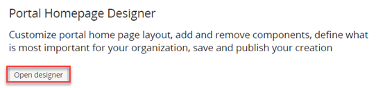
Setup > Global Settings > Service Portal.
Open the Homepage Designer
-
Navigate to Setup > Global Settings > Service Portal.

- Under Portal Homepage Designer, click Open designer.
- In the open Portal Homepage Designer, you can add ore remove widgets to customize your home page.
Widgets
The Search widget
By default the Search widget displays at the top of the Homepage Designer. You can edit or remove it using the icons in the upper right.
-
To edit the Search widget, click
 . A new pane opens on the left with edit options:
- Welcome Message
- Welcome Message Text Color
- Search Message
- Background (color or image)
- Background Image. The background image changes with the size of the user's window. A 2560 x 1080 image (or 1280 x 213 px) adjusts well on all screen sizes.
-
To remove the Search widget, click the ellipsis icon and remove.

Add/Remove other widgets
-
At the top, click Add Widget to reveal the widget dropdown menu.

-
Select a widget from the dropdown. Widget options are:
- My Requests
- Services
- Solutions
- Custom Message
- Custom Tile
Widget edit options
The table below provides examples of editing options per widget.
| Widget | Edit options |
|---|---|
| Search |
|
| Services |
|
| Solutions |
|
| My Requests |
|
| Custom Tile |
|
| Custom Message |
|
 icon in the lower right to display a toolbar you can use to format content in the Description field.
In addition to using the rich-text field toolbar to format content, you can use it to embed videos from services such as Loom, Google Drive, Wistia, Dailymotion, Dropbox, LinkedIn, Vimeo, YouTube, Microsoft Stream, and more.
icon in the lower right to display a toolbar you can use to format content in the Description field.
In addition to using the rich-text field toolbar to format content, you can use it to embed videos from services such as Loom, Google Drive, Wistia, Dailymotion, Dropbox, LinkedIn, Vimeo, YouTube, Microsoft Stream, and more.Additional customization options
-
You can drag and drop widgets to organize them in a manner that emphasizes what matters most to your end users.
-
You can change the size of the tiles to draw attention to those used most often.
-
You can hover over a new Widget and click Edit
to further edit your view. The Edit Widget pane displays on the left allowing you to, label the title, include a link, add an icon, or change the icon color or text color. 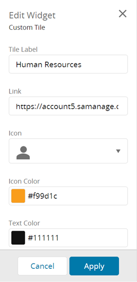
- Use the Save & Preview, Save, and Publish icons after you have edited your new widget.

- Save & Preview saves your changes and lets you immediately view the changes.
- Save simply saves your changes so you can decide to publish later.
- Publish makes your changes available to anyone who can see your service portal.
- Duplicate or delete a widget by hovering over it and clicking the ellipsis icon.

- After you complete your customization, you can save the widget by clicking Save at the top. . Save & Preview allows you to save and then immediately view the changes.
- After you complete your customization, you can duplicate the new widget or delete it.
Example designs
Below are examples of customized Portal Homepage designs. You can see that the search widget is at the top of the first two, but not the third. You can also see that the tile arrangement is different on each. There are many different ways to design a portal home page. Decide what would work best for your organization.
Example 1

Example 2

Example 3

To continue customizing your portal home page, including uploading your company logo, selecting the favicon that displays on the tab in your browser. You can personalize the color scheme and more. See Service Portal settings and overview for more information.