Understand latest baseline details
The Latest Baselines option calculates thresholds for warning and critical alerts based on actual data and not a hard-entered value.
The following screenshots detail how baseline statistics and thresholds are calculated for individual component monitors based on the collected data.

Clicking Use Recommended Thresholds do not affect the chart.
Understand the Occurrences Chart
The horizontal (X) axis displays the range of values collected by the current component monitor during the data collection period. The vertical (Y) axis displays the frequency of each value collected during the data collection period.
The three colors of the chart show the values of the component monitor during different time periods: Day, Night, and All Hours. You can show or hide these time periods by checking and un-checking their respective boxes in the legend.
You can have the chart show a specific time range by dragging the mouse over a small area of the chart. Hovering over any area of the chart provides a tooltip with detailed information about that area of the chart.
If you zoom in, a Reset Zoom button appears.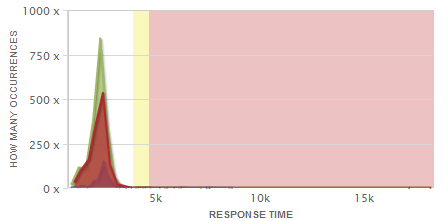
The yellow and red shading of the chart indicates the recommended Warning and Critical thresholds, respectively. These shaded areas are taken from the values recorded in the Latest Baseline Statistics table.
The ability to check and uncheck the boxes in the legend is for visual purposes only and does not affect the values generated for calculated thresholds.
Understand the Metric Over Time chart
The horizontal (X) axis displays the time period for when the values were collected for the current component monitor. The vertical (Y) axis displays the range of all the values collected during the charted time.
In other words, the light blue bars show the range of values for the statistics collected during the charted time period. The bottom of the bars indicates the lowest statistic collected, or the minimum. The top of the bars indicates the highest statistic collected, or the maximum. The blue line of the chart shows the average values of the component monitor through time.
Using the legend, you can show or hide these statistics by checking and un-checking their respective boxes.
You can have the chart show a specific time range by dragging the mouse over a small area of the chart or by using the sliders located at the bottom of the chart. Hovering over any area of the chart provides a tooltip with detailed information about that area of the chart.

The yellow and red of the chart indicates the recommended Warning and Critical thresholds, respectively. These shaded areas are taken from the values recorded in the Latest Baseline Statistics table.
The ability to check and un-check the boxes in the legend is for visual purposes only and does not affect the values generated for calculated thresholds.
Understand the Latest Baseline Statistics Table
Along with the minimum and maximum values displayed, the Latest Baseline Statistics table at the bottom of the display shows the average baseline statistics surrounded by three levels of standard deviation for both day and night data. This table highlights the recommended Warning and Critical thresholds in yellow and red, respectively.

In addition to using the recommended threshold values, you can hover the mouse over any value in the table to bring up a tooltip dialog. The tooltip dialog allows you to visualize, but not change, the value for the Warning or Critical threshold to the value you are hovering over by simply clicking either link in the dialog. Visualizing a value in this way affects the chart above the table by repositioning the shading indicating the Warning and Critical threshold areas.
Understand baseline details and setting thresholds
The right column of this view provides information about the data's calculation and usage and allows you to set thresholds.

In the Current Thresholds Settings area, you can manually change the values for both the Warning and Critical thresholds, or use the recommended values by clicking Use Recommended Thresholds.
Additionally, you can add logic for these thresholds by selecting an operator from the drop down list such as Greater Than, Less Than, Equal To, and so on. The logical operator selected applies to both the Warning and Critical thresholds and cannot be separated. For example, if you select the Greater Than or Equal to operator with a Warning threshold value of 80 and a Critical threshold of 90, the thresholds are considered met if the returned value for the current performance counter meets or exceeds 80 for Warning or 90 for Critical.