View your site metrics
After you set up and configure a new monitoring site, Pingdom begins collecting data from all users who visit your site. The data is processed and aggregated into easy-to-understand charts and graphs that display in the Real User Monitoring page. You can view additional details about the site data by clicking View Details.
You can view additional details about the site data by clicking View Details. Click the ellipsis  to edit the monitored site details, share the data, view a code snippet, or delete the monitored site.
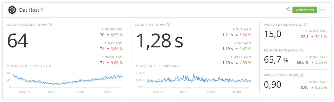
Below is an example of a monitored site.
The following table describes the data in the site resource.
| Filter | Description |
|---|---|
| Active sessions | Displays the number of sessions with one or more interactions in the last five minutes. |
| Load time | Displays the amount of time required to download and render all synchronous web page assets, including images, scripts, CSS, and third-party resources. |
| Page views | Displays the website server load. |
| Bounce rate | Displays the percentage of visitors who navigate away from your website after viewing one page. |
| Apdex score |
Displays the level of visitor satisfaction based on their load time. The Application Performance Index (Apdex) is an index ranging from zero to one, where the higher value is better. |
View the site details
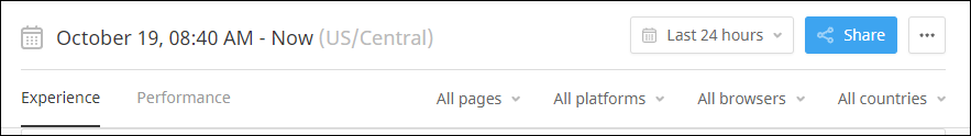
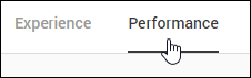
The site details page includes two views: Experience and Performance. Both views provide different information about your users. To access the site details, click View Details in the monitored site resource.

Data filters
You can filter the data that displays in the views and corresponding graphs using the toolbar options.
The drop-down menus allow you to filter the user experience data based on a span of time (for example, the last 24 hours), a selected documentation page, computer platform, web browser, and country. Click the appropriate drop-down menus to select your filters or use the default options to display all user data in the views and graphs.
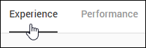
Experience view
The Experience view allows you to view the number of active sessions, Apdex score, average load time, and bounce rates. This data can provide a deeper understanding about your users, their geographical location, and the experience they are having on your website.
To access this view, click Experience in the top left corner of the page.
The Dashboard provides an overview of your customer experience data.

The following table describes the data in the dashboard.
| Filter | Description |
|---|---|
| Active Sessions (Now) | Displays the total number of sessions with one or more interactions during the last five minutes |
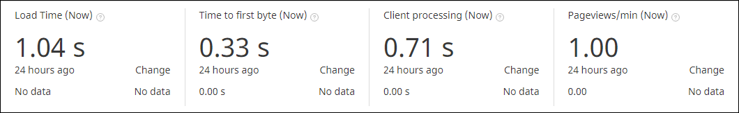
| Load Time (Now) | Displays the time required to download and render all synchronous page assets. |
| Apdex Score (Now) |
Displays the visitor satisfaction level of your site based on their load time. Apdex is an index ranging from zero to one, where higher is better. |
| Bounce Rate (Now) | Displays he percentage of visitors who navigate away from your site after viewing one page. |
The proceeding views and graphs provide additional information about the users who visit your website.
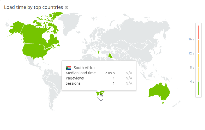
The Load time by top countries view displays the median load time for the 30 countries with the most visitors to your site. Mouse over a country to view the statistics.
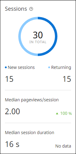
The Sessions view displays the total number of sessions split across new and returning users. This view also displays the user visit duration and the average number of pages visited by each user.
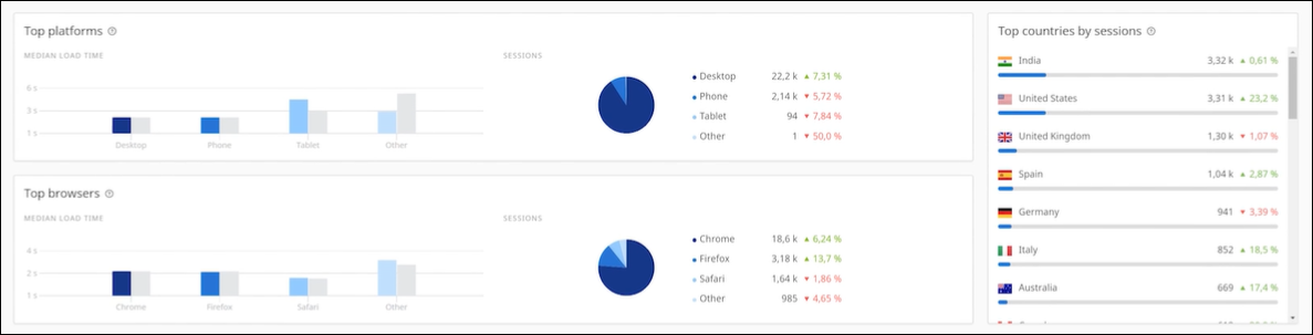
The Top platforms graph lists the platforms used to access your website. These platforms include desktops, phones, and tablets. You can also view details about the top web browsers used to access your website, as well as the top countries where these users live.
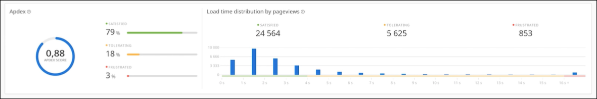
Apdex is an open standard for measuring software application performance. It provides a simple and calculated method to indicate whether your website performance meets the user's expectations. You can use this index to identify issues with your website or website provider.
The Apdex graph displays the level of visitor satisfaction based on their load time. The response time is categorized into three categories: Satisfied, Tolerating, and Frustrating. The corresponding graph displays the Load time distribution by page views for the selected time period.
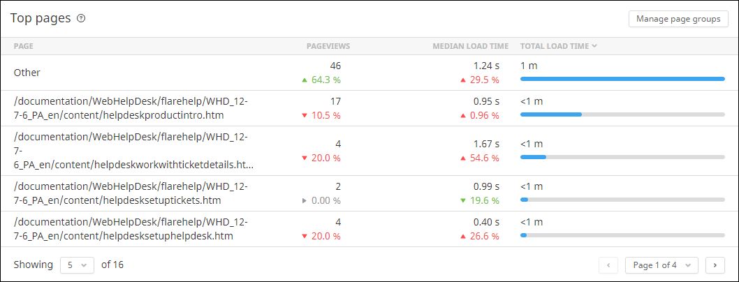
The Top pages graph displays your site's most visited pages during a selected time period. You can organize your pages into logical collections of content called page groups. These groups allow you to view and compare the aggregated metrics that provide a broader picture of your site performance. You can create up to 10 page groups.
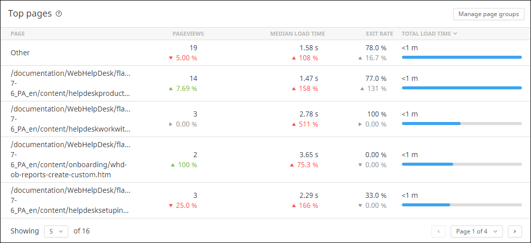
The following table describes the data in the top pages graph.
| Filter | Description |
|---|---|
| Page Views | Displays the total number of views each page received during the selected time period. |
| Median Load Time | Displays the median load time during the selected time period. |
| Exit Rate | Displays the percentage of page views that were viewed last during a session. |
| Total Load Time | Displays the total time visitors spent waiting for a certain page to load during the selected time period. |
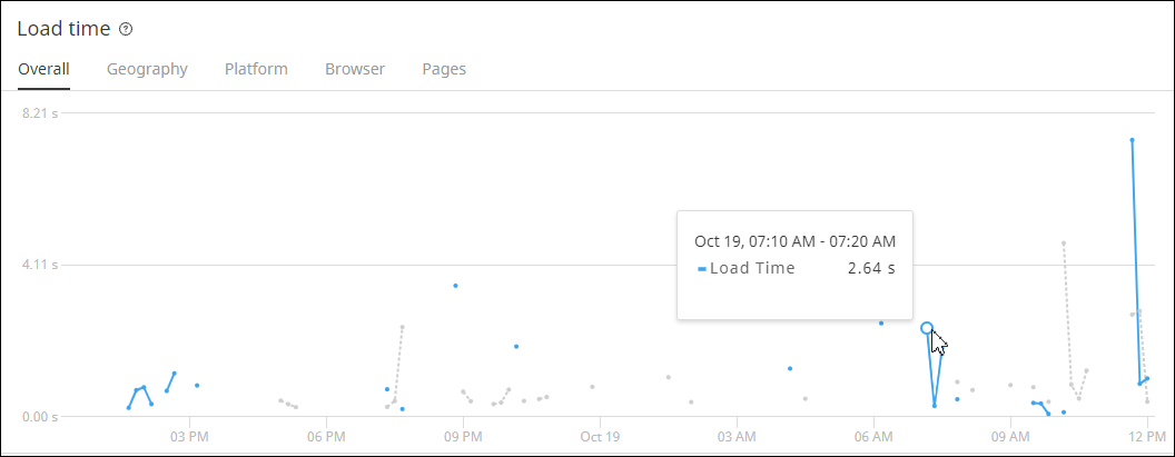
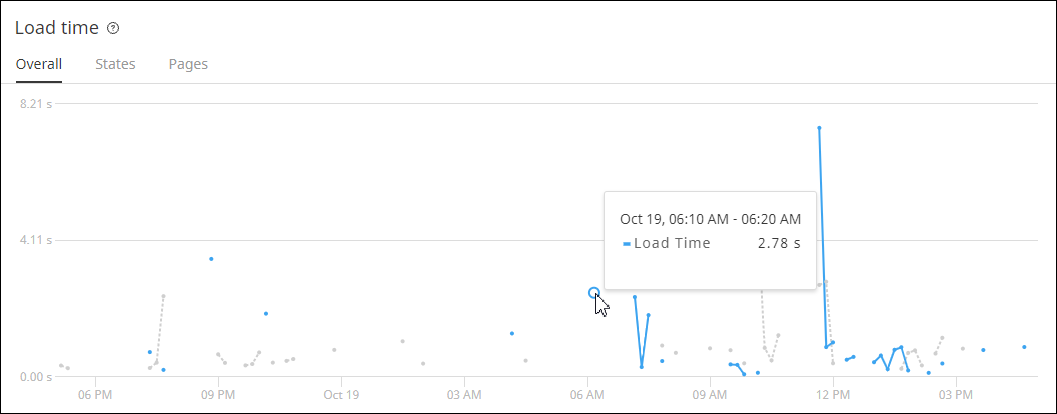
The Load time graph displays the amount of time required to download and render your site's assets, including images and related content. The graph displays the measured time between the navigation start and load event start timings. You can view the overall load time or the load time for a specific geography (or country), computer platform, web browser, or top page. Hover your mouse arrow over a chart reading for specific details.
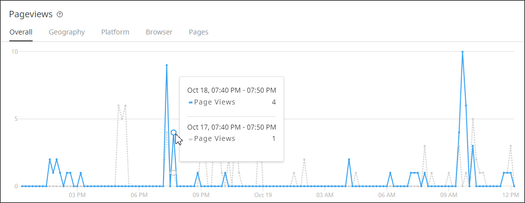
The Pageview graph displays the number or page views at specific points in time over a selected time period. You can view the overall page views or the page views for a specific country, computer platform, web browser, or top page. Hover your mouse over a datapoint to view details for a specific date and time.
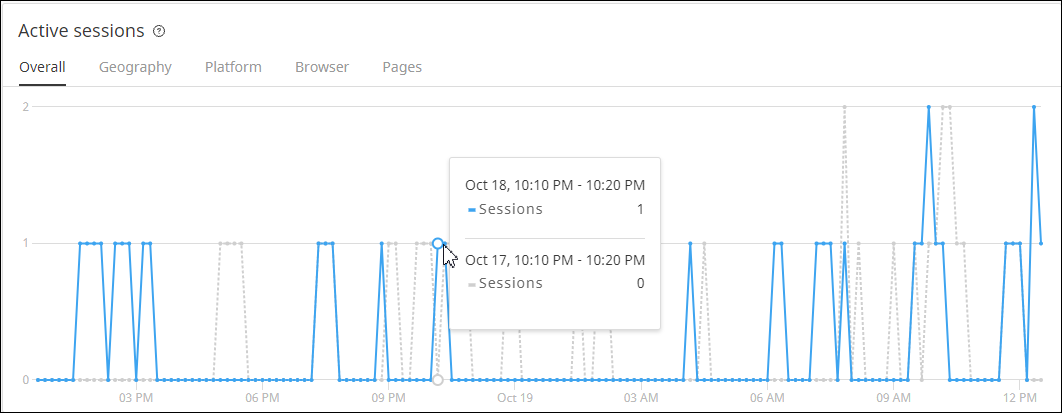
The Active sessions graph displays the average number of active sessions at a specific point in time over a selected time period. A session is active when it has at least one interaction in five minutes. You can view the overall number or active sessions or the number of active sessions for a specific country, computer platform, web browser, or top page. Hover your mouse over a datapoint to view details for a specific date and time.
Performance view
The Performance view allows you to view the average load time for states over a selected period of time. The data displays in a graph, with easy to use filtering options to single out any particular state.
To access this view, click Performance in the top left corner of the page.
The dashboard provides a summary of your site performance metrics.
The following table describes the data in the dashboard.
| Filter | Description |
|---|---|
| Active Sessions | Total number of sessions with one or more interactions during the last five minutes. |
| Load Time | Time required to download and render all synchronous page assets. |
| Apdex Score | Level of visitor satisfaction based on their load time. Apdex is an index ranging from zero to one, where higher is better. |
| Bounce Rate | Percentage of visitors who navigate away from your site after viewing one page. |
The Load time graph displays the amount of time required to download and render all synchronous page assets. Hover your mouse over a datapoint in the graph for specific details.
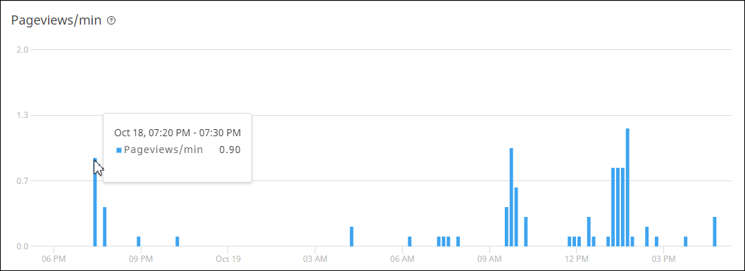
The Pageviews/min graph displays the site server load at various times of the day. Hover over a datapoint to view specific details.
The Top pages resource displays your site's most visited pages during the selected time period.
Navigation Notice: When the APM Integrated Experience is enabled, Pingdom shares a common navigation and enhanced feature set with other integrated experience products. How you navigate Pingdom and access its features may vary from these instructions.