Charts
Navigation Notice: When the APM Integrated Experience is enabled, Loggly shares a common navigation and enhanced feature set with other integrated experience products. How you navigate Loggly and access its features may vary from these instructions.
A chart is a graphical representation of data, in which the data is represented by symbols, such as columns in a column chart, lines in a line chart, or slices in a pie chart. Charts are often used to ease understanding of large quantities of data and the relationships between parts of the data.
Visualizing Search Results
You can plot the results of your Loggly search query and tailor it to visualize the search data in graphical form, such as on a bar or line chart. You can monitor your most important charts by adding them to your dashboard.
Creating a Chart
Go to the Charts page and click + New Chart.
If you see a pop-up window, provide a name for the new chart. If not, click the pencil icon, and then change the name from Untitled Chart to the name of your choice.
The chart name is unique to each owner of the chart so different team members can use the same name for different charts without conflict.
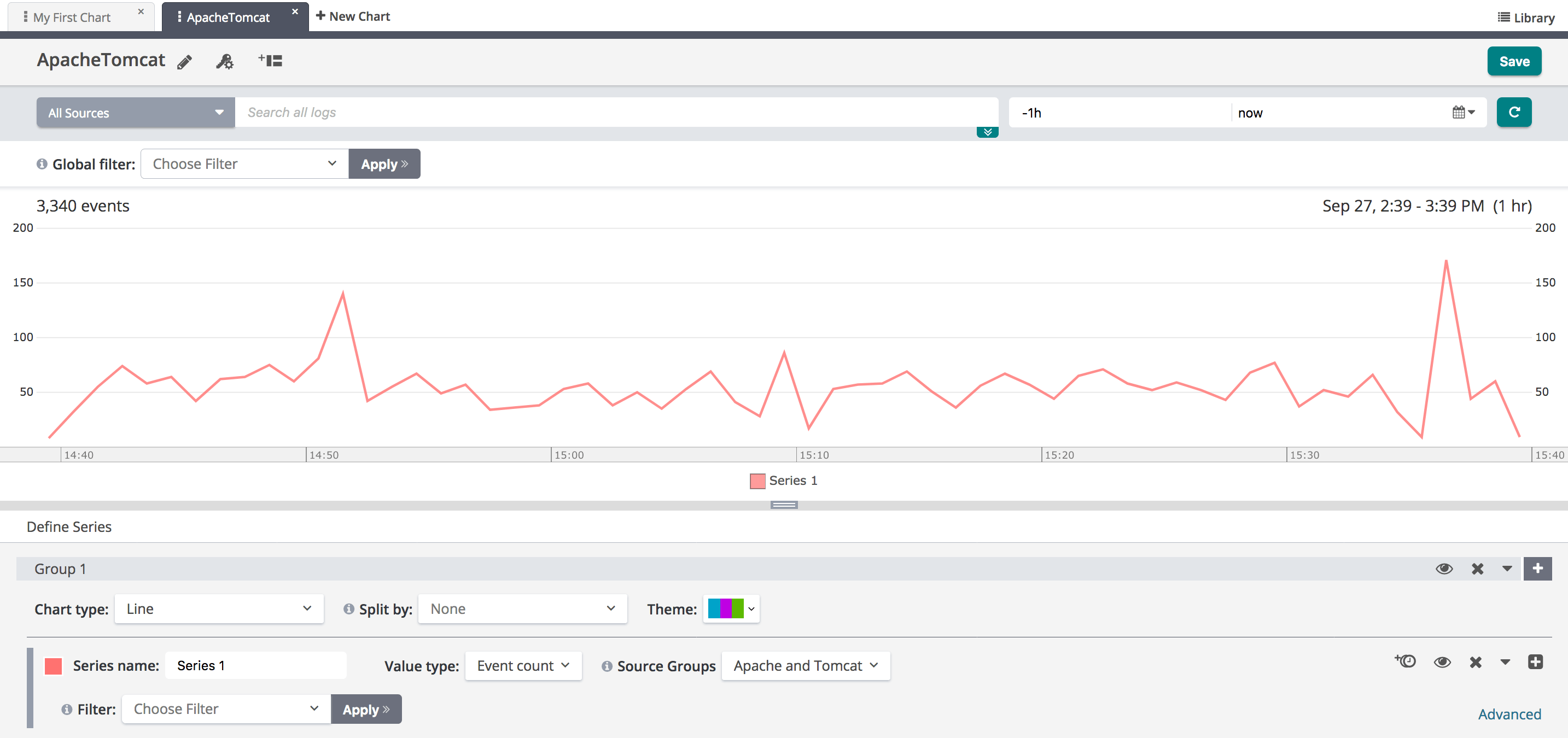
Above the chart you can define the source and set specific time criteria for the search.
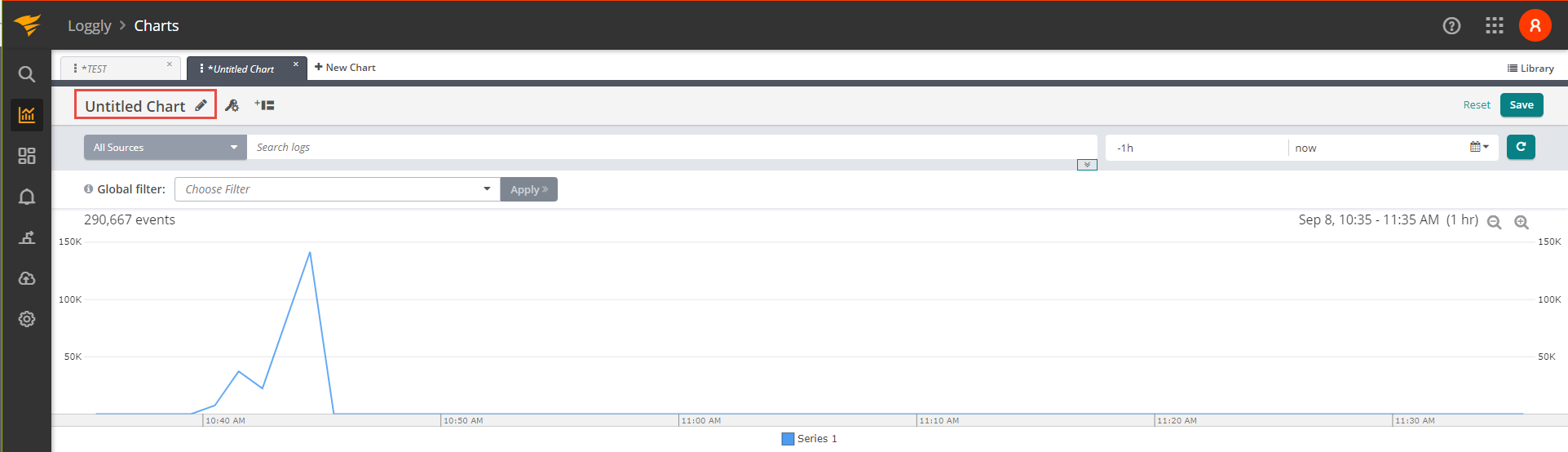
Below the chart, you can define the chart series. For example, you can set the chart type for a series, modify the series name, establish the value type, and filter by source group, fields, logtype, and Loggly Notifications, etc.
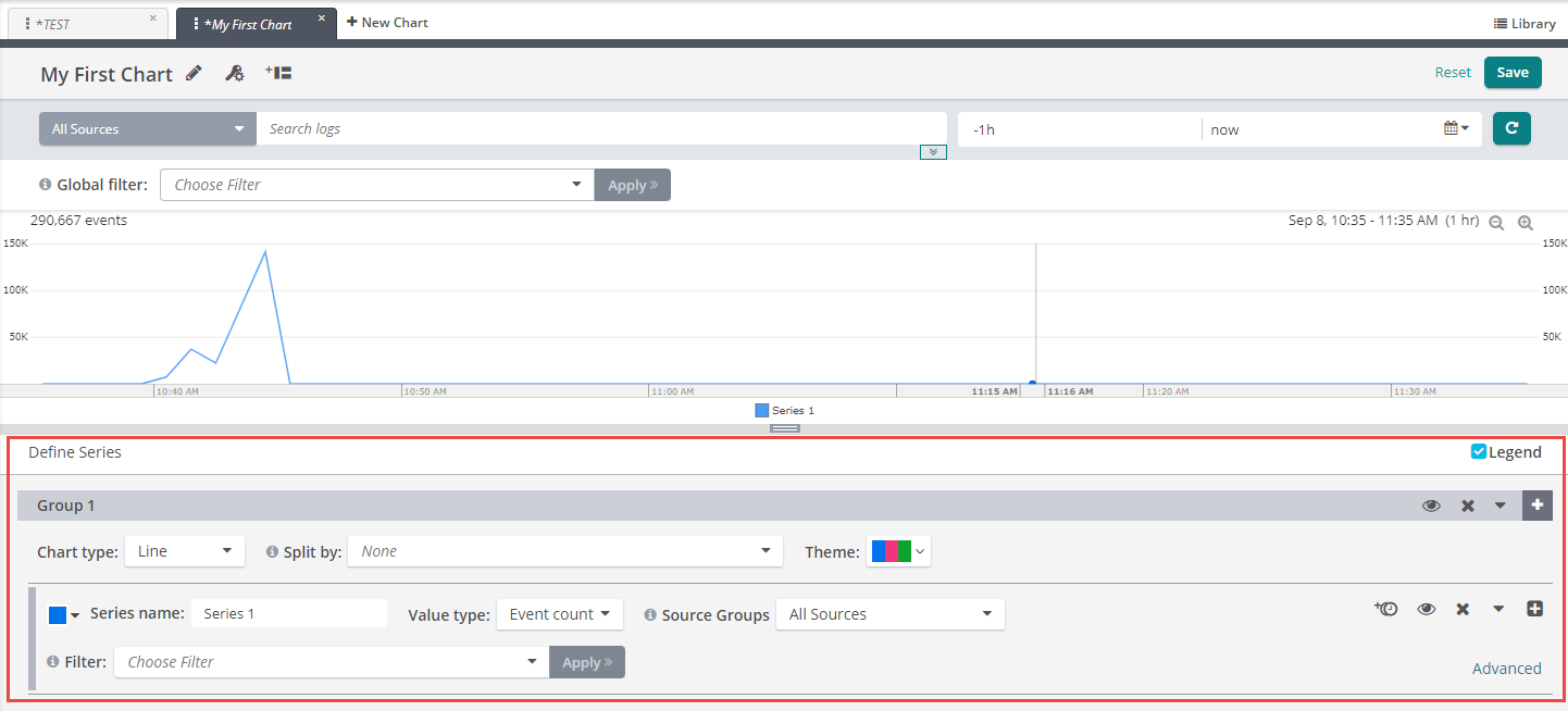
Chart Types
Loggly supports several different chart types so data can be displayed the way you want.
Time Series Charts
Line Chart
The line chart is represented by a series of data points connected with a straight line. Line charts are most often used to visualize data that changes over time.
When to use Line charts
Line charts are easy to use and visualize time series data. Line graphs are useful when:
- Monitoring specific metrics from one source or multiple sources. For example, average latency across your web servers.
- Monitoring all related metrics sharing similar units. For example, maximum latency for all your disk operations such as disk reads and disk writes.
- Monitoring metrics that have clearly defined acceptable thresholds. For example, latency of user requests on your website.
- Monitoring the same metric across different devices or servers. For example, CPU utilization on each production server.
- Monitoring metrics where individual values from a specific resource is important. For example, heap size on each machine.
The chart below is an example of a line chart plotted in Loggly.
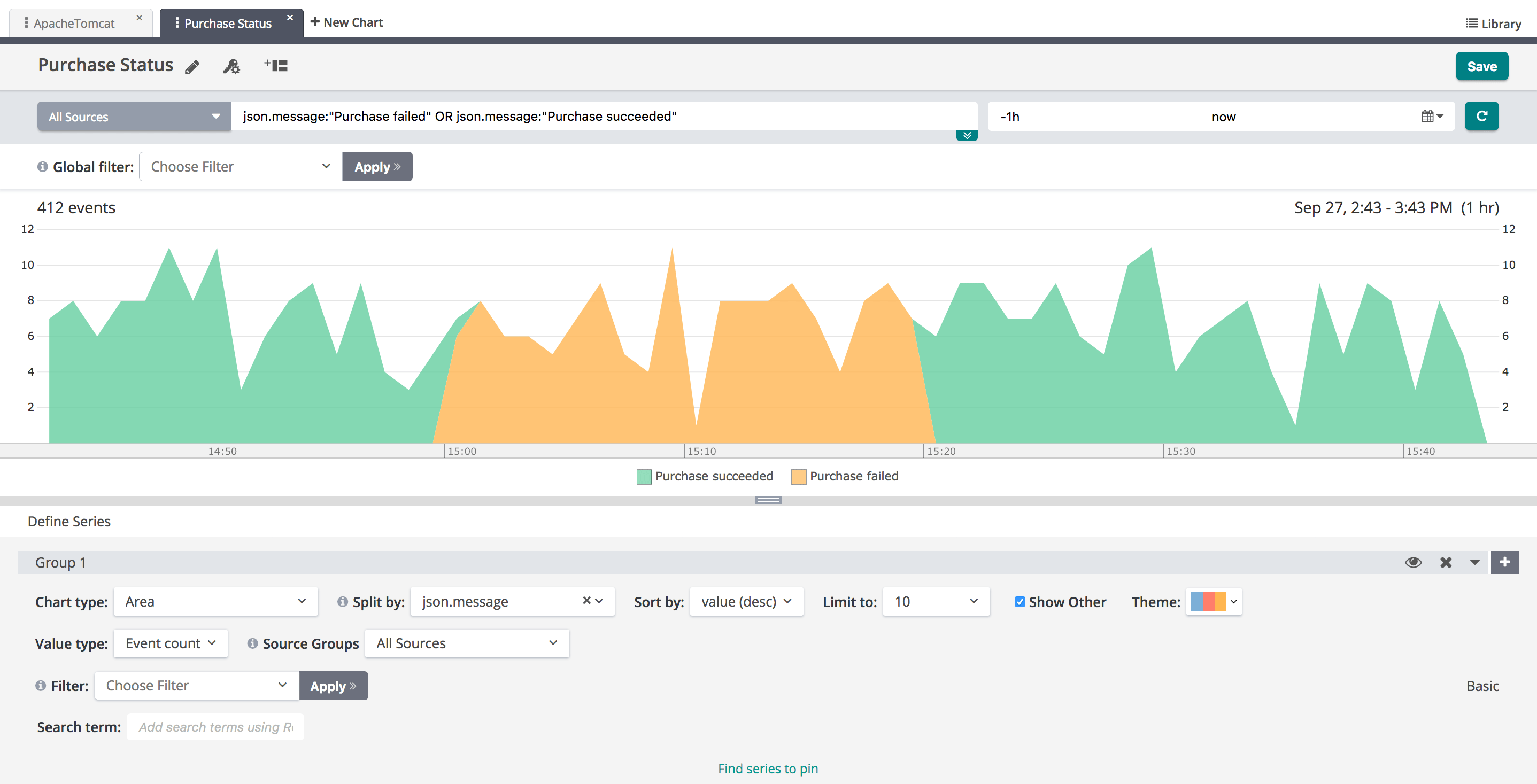
Area Chart
Just like line charts, area charts are easy to use and visualize time series data. However, the different values are represented by two-dimensional bands instead of lines. Data from different time series are summed together and stacked. Area charts are difficult to interpret when there are too many data series. For example, if each area is just a few pixels or a thin line, then it is hard to identify important trends.
When to use area charts
Area charts are useful when:
- Monitoring the same metric across different devices or servers. but stacked. For example, user requests on each production server.
- Monitoring similar metrics for the same device or a server with similar units. For example, CPU utilization metrics (user, system, idle, etc.).
The chart below is an example of an area chart plotted in Loggly.
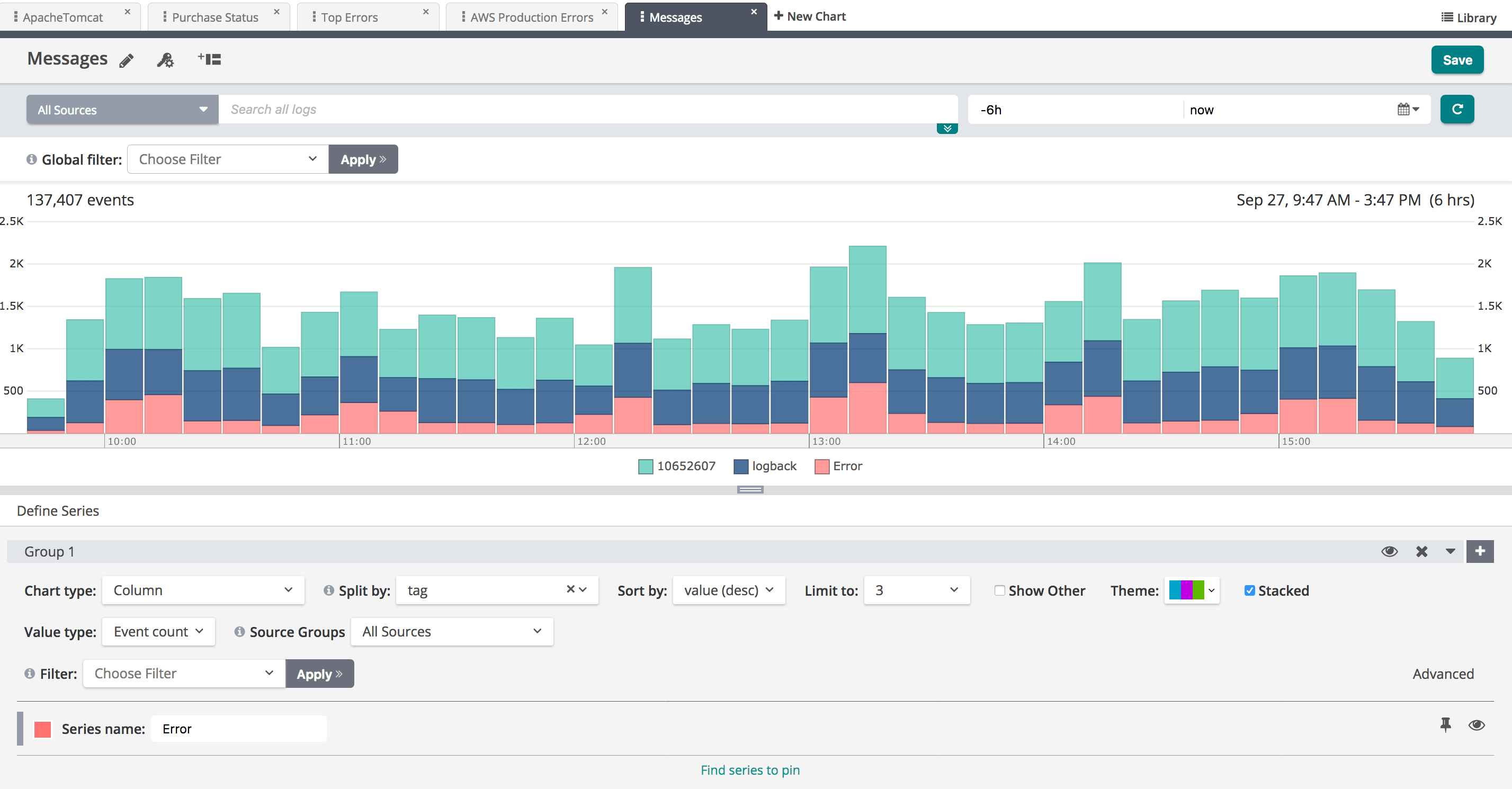
Column chart
Column charts can also be used to visualize time series data. In Loggly, the most prominent example of the column chart is an All Events Histogram on the Search page. It allows you to visually identify a trend across your time series data.
In a stacked column chart, each column represents the sum of the values for that time interval. In each column, each stack represents the values for a different category. Therefore, this feature makes a column chart very useful when visualizing counts over a period of time, especially sparsely distributed metrics. Like area charts, they naturally accommodate stacking and summing of data values. In Loggly, a column chart can be stacked by selecting the stacked check box.
When to use column charts
- Monitoring errors from IoT (Internet of Things) devices. For example, sensors that send data sporadically.
- Monitoring count of specific metrics. For example, user logins, user transactions, etc.
The chart below is an example of a stacked column chart in Loggly.
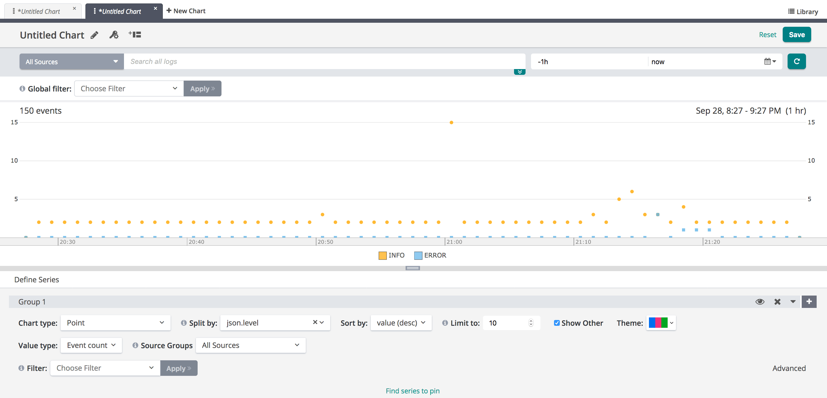
Point Chart
Point charts consist of various points (or dots) that commonly represent a large quantity of data and can be used to locate trends or averages.
The chart below is an example of a point chart in Loggly.
Non-time-series charts
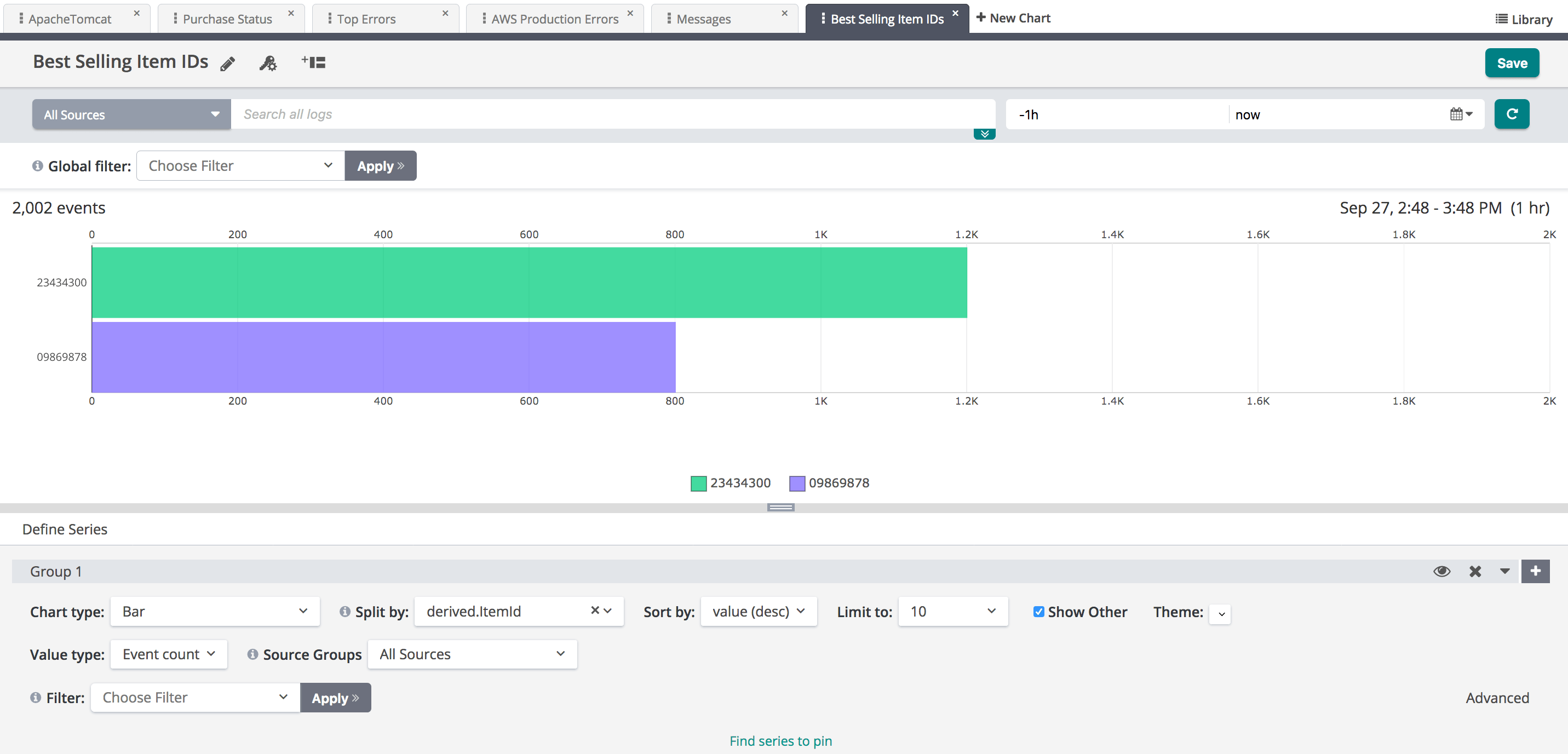
Bar chart
Bar charts present grouped data with bars whose lengths are proportional to the values they represent. Bar charts are useful in comparing categories. One axis of the chart shows the specific categories being compared, and the other axis represents a discrete value.
The chart below is an example of a bar chart in Loggly.
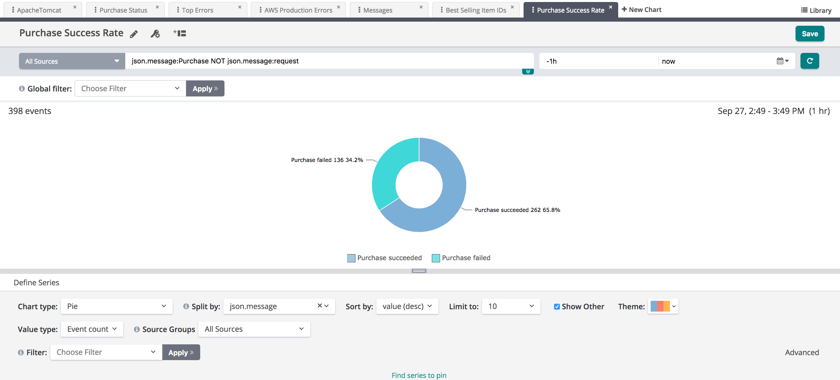
Pie chart
Pie charts divide data into slices to illustrate numerical proportion. In a pie chart, the arc length of each slice (and consequently its central angle and area), is proportional to the quantity it represents.
The chart below is an example of a pie chart in Loggly.
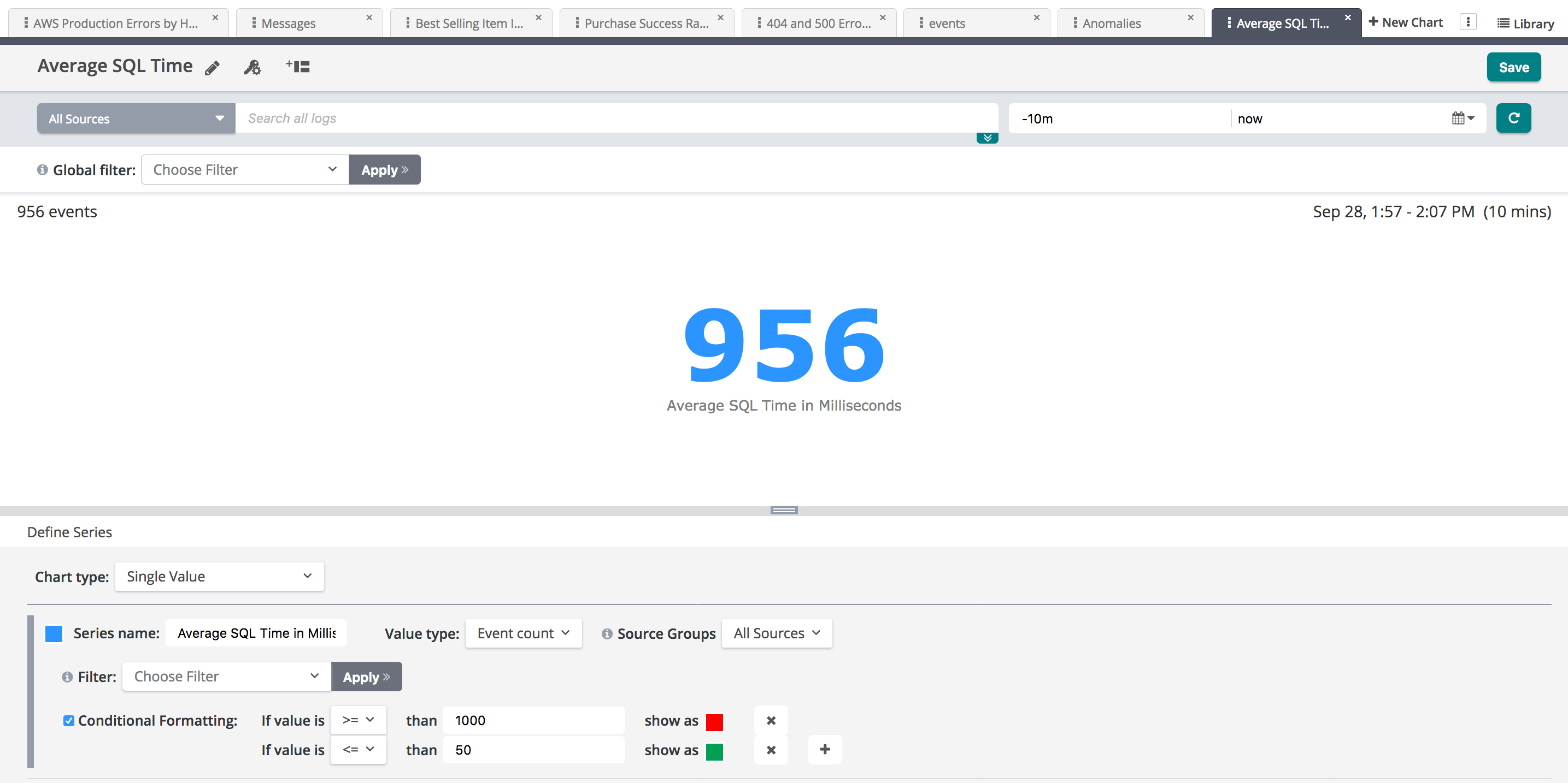
Single Value Chart
Single value charts are useful for displaying the results of a query that returns only a single record in order to make that value stand out at a glance. You could also use conditional formatting of the text color by specifying a threshold value. Single value charts allows you to quickly understand when the value is under the limit or outside of the limit.
The chart below is an example of a Single value chart in Loggly.
Anomalies Chart
Anomaly detection is an algorithmic feature that allows you to identify when a metric is behaving differently than it has in the past, taking into account trends, seasonal day-of-week and time-of-day patterns. It is well-suited for metrics with strong trends and recurring patterns that are hard or impossible to monitor with threshold-based alerting.
The chart below is an example of an anomalies chart in Loggly.
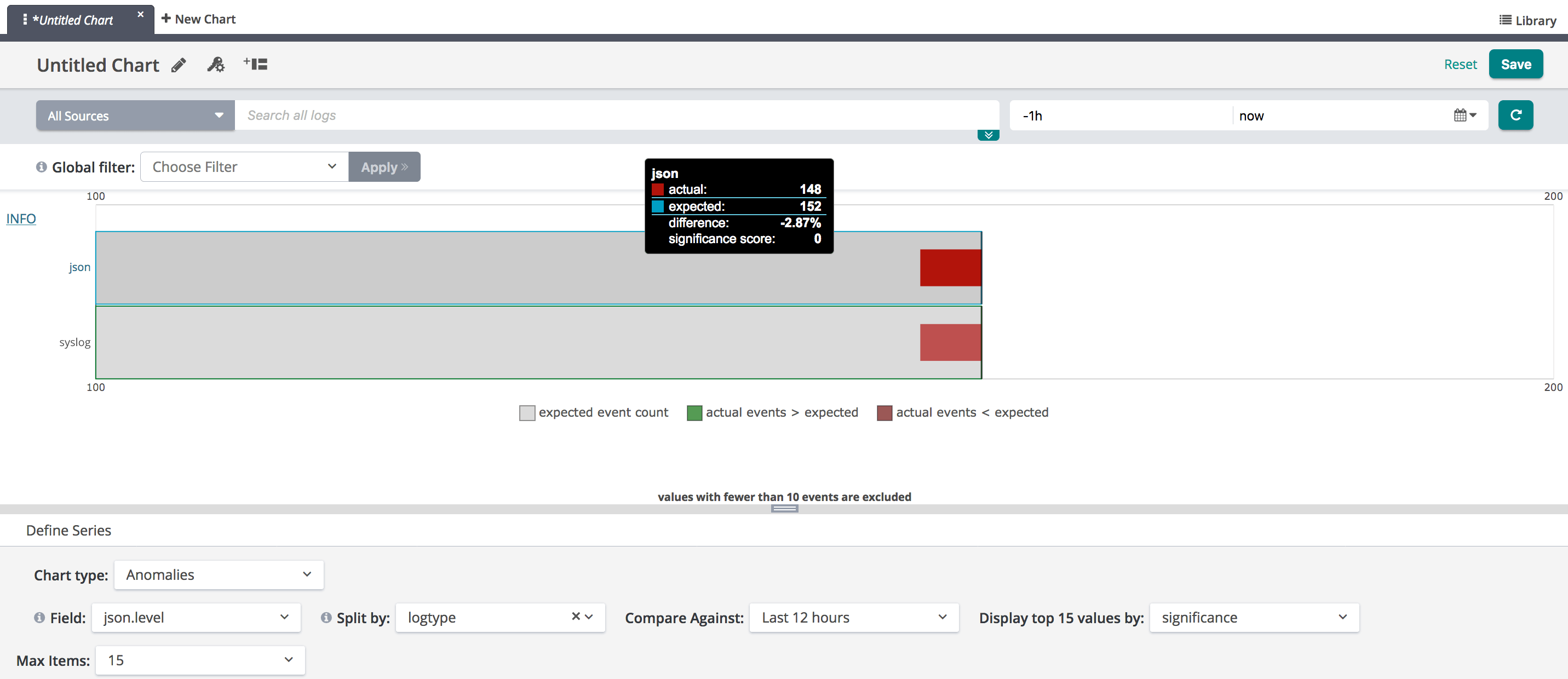
Chart Settings
The various settings for chart types and settings that help you manipulate charts is presented in detail below.
-
Groups. Groups are a logical way to organize chart data. Group 1 is the default group. All data series in a single group has the same chart type. To overlay a line chart on top of a column chart, create Group 1 with line chart and add a second group, Group 2, with column chart. You can create multiple groups to produce more data-rich charts. To add more groups, click the plus (+) symbol. This adds a second group below Group 1. Continue adding groups as needed.
-
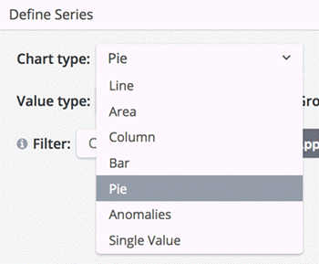
Chart type. Select the chart type of choice to visualize your data for a group.
-
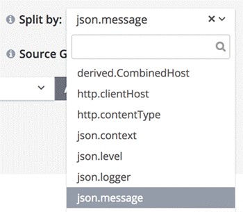
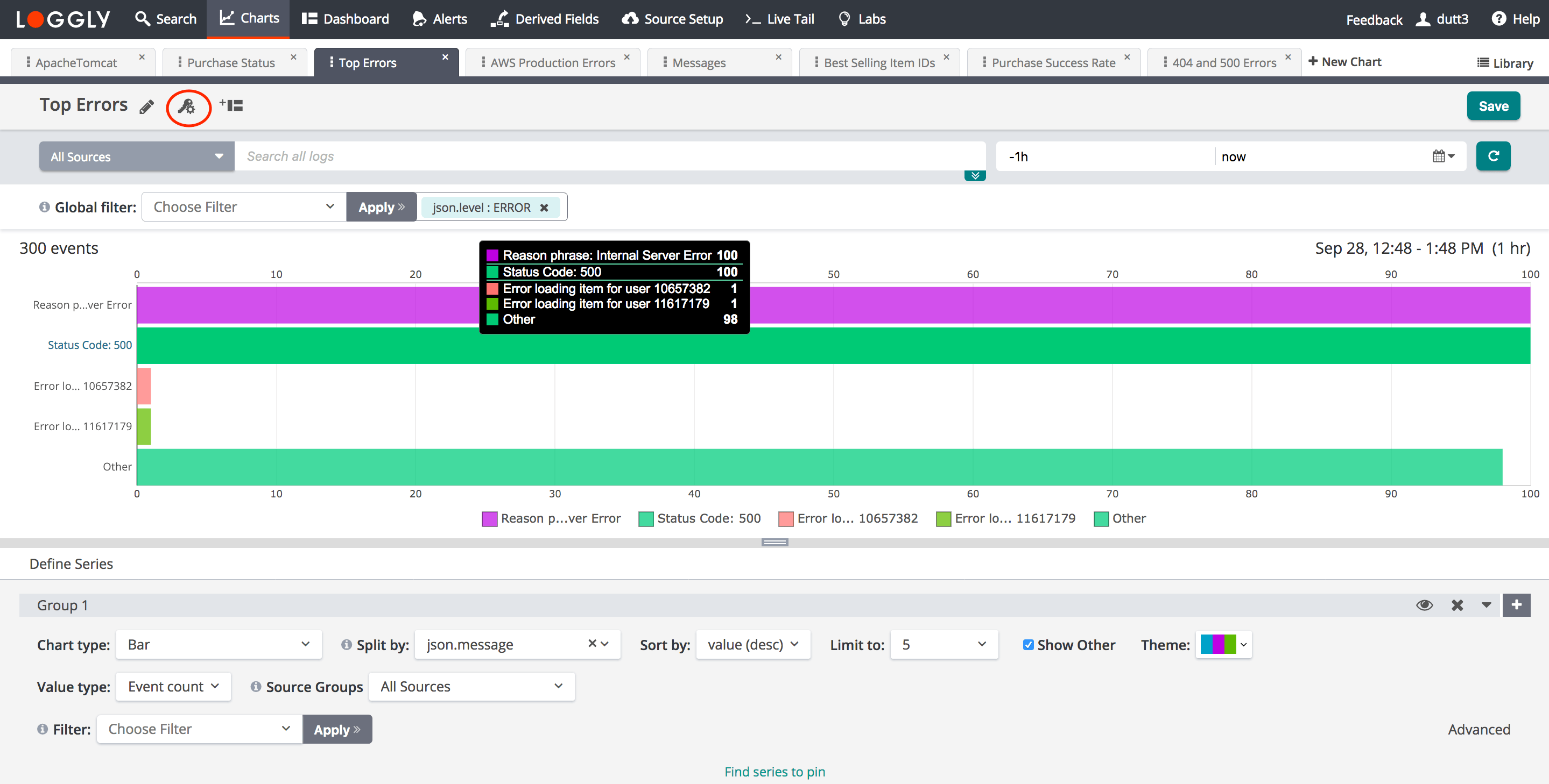
Split by. Split by creates data series automatically for you. You can split the data based on different hosts, applications, tags, and logtype, among other things.
If a field contains over 500 characters, the data will not be included.
-
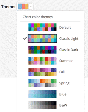
Theme. This option allows you to specify the colors to be used when data series are automatically created based on Split By. You can select a color theme for a group by selecting from a list of different color themes. If no selection is made, the chart uses the Default theme.
-
Stacked. To stack the results, select the Stacked check box. Multiple time series can be summed together simply by stacking the bands.
-
Value type. The value type option allows you to specify what data you are plotting. The options are Event count, Percentile, Statistics, and Value. The default is Event count.
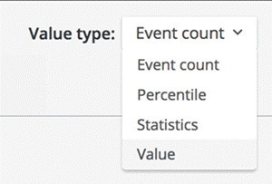 Selecting Percentile in the Value type drop-down menu allows you to view metric data by percentile (example: 99th, 95th, 50th, or other values). The 50th percentile is also similar to the median of the data set.
 -
Source Groups. If you have not already selected a specific source group for the search in the drop-down menu next to the search field, you can select a particular source group for each group.
-
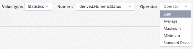
Numeric Field. When you select Statistic as the Value type, you must specify which numeric field you wish to plot. You can also select the operator to be used. Supported operators include sum, average, maximum, minimum, and standard Deviation.
-
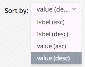
Sort by. You can sort the data in ascending or descending order by the value or label of a field. This ordering allows you to specify which data series the chart diplays. For example, to see the top 5 status codes for apache.status in the last hour you would select value (desc), for descending. The displayed data depends upon the Limit to value selected as shown in the next bullet.
-
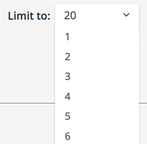
Limit to. This option allows you to specify the maximum number of data series displayed on the chart. You can select a value from 1 to 50. The default value is 10.
-
Show other. The Other category is an aggregation of all the results that are not directly displayed on the chart. Selecting the Show Other option allows you to display this aggregated category on the chart. By default, this option is selected.
-
Advanced. The Advanced option allows you to add a search term to customize the chart even more.
-
Hide/Unhide. Clicking the eye icon hide or unhides the selected group in the chart.
-
Collapse/Uncollapse. Clicking the collapse/uncollapse icon can be used to hide or reveal the Group settings to create additional working area on the screen.
-
Add a new group. You can create multiple groups to produce more data-rich charts. Group 1 is the default group. To add additional groups, click the plus (+) symbol.
-
Add a new data series. In order to add a new data series, click the plus (+) icon to add another series.
-
Find series to pin. To always include a specific data series in a chart, you can find that data series and pin it. This feature is useful when your data has high cardinality and you would like to ensure a specific data item is displayed regardless of its value. For example, if you have 100 hosts and you would like to display errors for only 10 hosts, and you would like one specific host (example: host_24) to always be displayed in the chart, regardless of its value, you can use this setting to find and pin that specific host. Once pinned, host_24 would always be present in the data series that are included on the chart even if host_24’s data is zero.
The setting named Limit to determines how many data series display on the chart. If this value is 10 and you have pinned 4 data series, then 6 other non-pinned data series are included on the chart. If you would like more than 6, increase the Limit to value to greater than 10. You can set this value between 1 and 20.
Also, to pin a point in time, the data table is automatically displayed. When you move the cursor through different areas on a chart, the plot line under the cursor is highlighted, and the detail line for that plot line is highlighted. Just as hovering over a plot line highlights a line in the data table, hovering over a line in the data table highlights the corresponding plot line on the chart. -
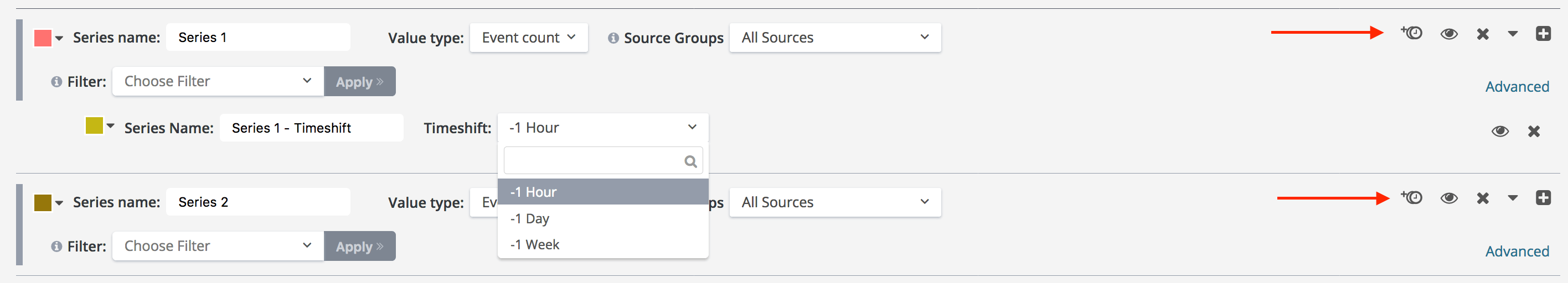
Timeshift. The timeshift function allows you to compare the chart data in a data series with a previous time range. That is, you can compare the metric by adding a shift of 1 hour, 1 day, or 1 week in the time range to show how the metric performed at an earlier period. The timeshift function is available for each data series you add to the chart.
Using the Timeshift function to understand trends
In infrastructure and application monitoring, the trend of a metric (the rate at which it is changing) is frequently of greater interest than the absolute value of the metric itself. For example, it might not be meaningful to know that your disk is 50% utilized, but you might care to know that the utilization has doubled consistently for the past 10 minutes, as that might indicate that the system is trending toward failure. The Timeshift function allows you to compare the chart data in a data series with a previous time range.
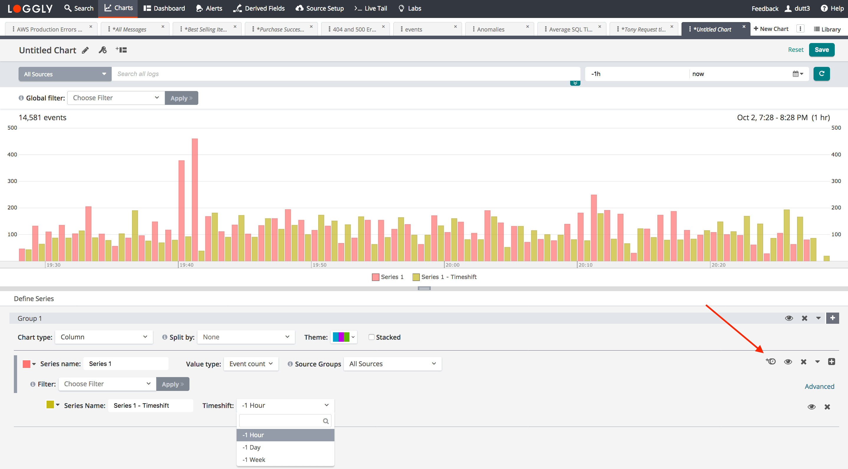
Chart permissions
When you are satisfied with your chart, you can save it for future use and share with other team members. You can set permissions to view or edit a chart by clicking on the share icon, shown circled in the image below.
Permission options are:
-
View permission. Allow other users in your account to view a saved chart.
-
Edit permission. Allow other users in your account to rename a chart, edit various chart settings, and transfer ownership of a saved chart.
Admins can edit any chart in your account's chart library.
Add a chart to a dashboard
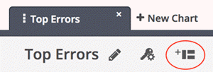
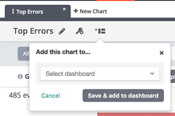
You can add a chart to your dashboard by clicking on the dashboard icon, shown circled below.
A pop-up window opens. Select a dashboard on which to display the chart. Click Save & add to dashboard.
Alternatively, you could go to the Dashboard page and add the chart from there.